Data visualizations: explorations in forecasting and predictions
The forecasting charts below are bespoke explorations I created when we were working on creating our next analysis offering. Sisu does use a design system but this new trend type required researching data forecasting, how to best tell the story and, in a way that’s easy to understand and consume.
Beyond this, I also wanted to take this opportunity to try and design something unique, inspiring, and interesting for our tool.
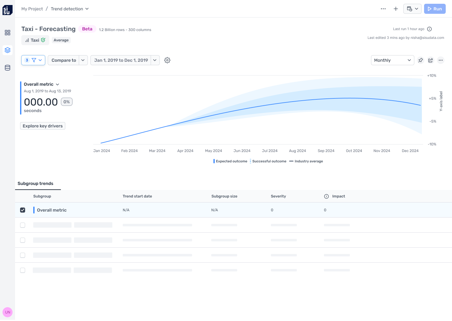
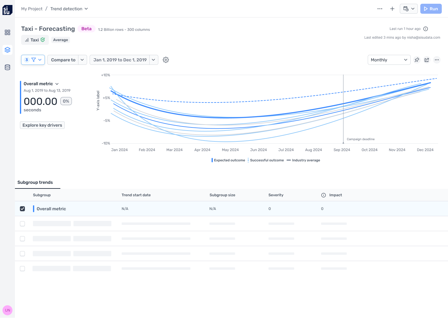
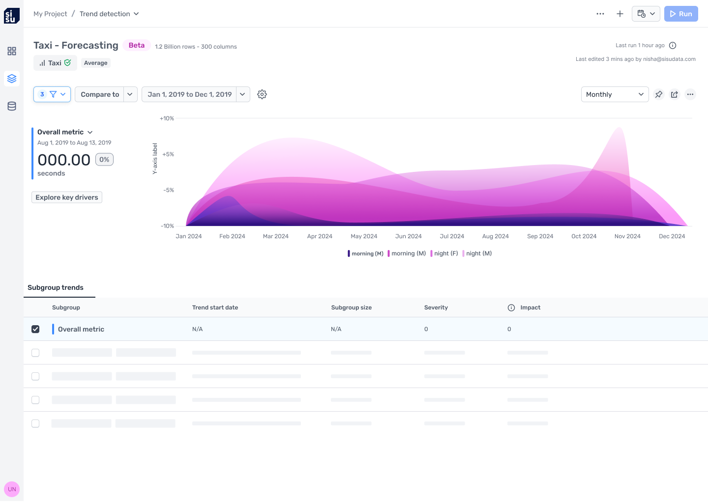
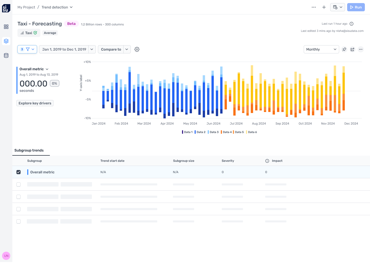
Forecasting and predictions explorations
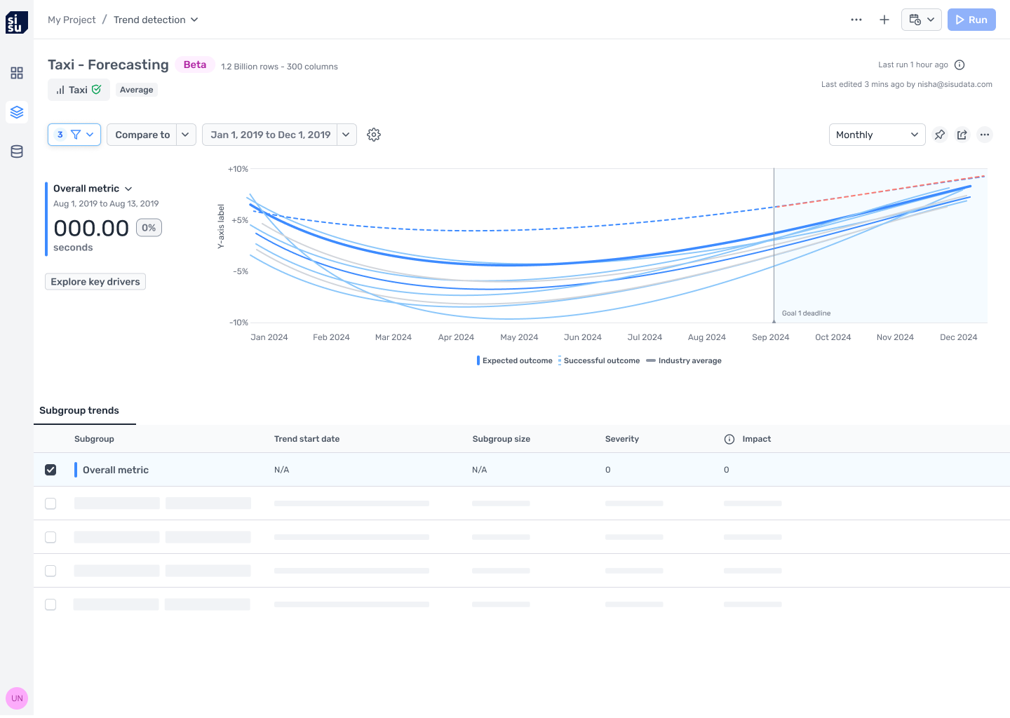
Forecasting visualizations should enable users to see the projections and expected outcomes for their data, what could be considered a “successful” outcome, and users should be able to compare their outcomes to industry averages.
The layouts I explored were designed to enable the data scientist or the data analyst to quickly understand future trends, how their business compares to the industry trends, and what could be considered a successful path forward. This project was ultimately put on hold due to a shift in company priorities.